![[object Object]](/static/SBI-new-3f05b8e8a65d5a738bcbf2b4b08ae8c3.svg)
![[object Object]](/static/HDFC-new-bbc46138c322f4e8beb5ef76c57a6aff.svg)


 All Tech Blogs
Mobile
All Tech Blogs


In the early days of PhonePe, we started with just one application. Our pace was fast, almost like a race against time, and our initial engineers managed to keep things tidy. Colors, typography, and size constants were well-organized, ensuring a cohesive look and feel. Our small but efficient team consisted of 3 Android developers, 3 iOS developers, and 2 designers.
Each constant was carefully discussed with the design team, and this collaboration led to the successful rollout of the first version of the PhonePe payments app. It felt like a well-orchestrated symphony.
As PhonePe experienced growth, with an increasing user base and number of screens, and a larger team, the initial structure faced scalability challenges. While efforts were made to avoid hardcoding UI attributes, the system for managing constants evolved organically, leading to some duplication and inconsistencies in color codes, size measurements, and typography. We soon realized over time, the app will begin to show variations in visual presentation across different screens. As the application suite became more complex, we needed a central solution: A Design System – a unified and scalable approach that could bring harmony and consistency across our apps.
This marked the beginning of our journey towards creating a Design System, setting us on a path to bring order to our development process and provide a seamless, polished experience for our users.
When we decided to build our first design system at PhonePe, we envisioned a modular approach to constructing our UI. We dedicated 2 engineers from our apps team and 1 designer to spearhead the effort for the PhonePe payments app.
Initially, we thought this would be a straightforward task simply defining constants and components to be used across the app. But as we delved deeper, we realized it was far from trivial. Creating a design system meant more than just defining components; it required alignment across our entire design and development teams.
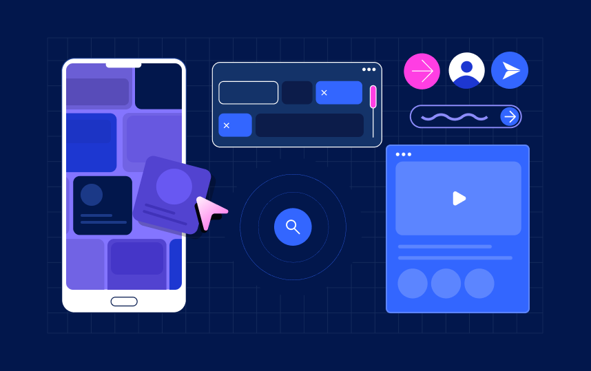
For instance, defining how a button should look involves considering all types of buttons: small buttons, rounded corner buttons, full-width buttons, and more. When a new variant of the button was needed, designers were expected to add it to the design system rather than creating custom versions. This required a significant cultural shift. Have a look at the image below which covers some of the variants of just one component button.
Aligning everyone was relatively easy when our team was small. But now, with a large team, each member with their unique working styles, achieving this alignment became incredibly challenging. Every designer was constantly developing screens in parallel, and convincing everyone to adopt the new components meant a period of adjustment and collaboration.
Despite these challenges, creating a unified design system was a necessary journey. It is the only way to get consistency and also improves collaboration, speeds up the development process, and enhances the overall user experience.
And thus began our journey with the design system to bring coherence and harmony to our UI, ensuring the PhonePe experience was seamless and consistent for all our users.
As we ventured further into the development of our design system, we quickly realized that a dedicated team would be essential. This team needed to work independently and focus solely on the design system. The comprehensive effort required to holistically consider every aspect of the system couldn’t be achieved as a side project. It was clear that the design system team had to be a distinct entity.
This team also needed to maintain constant interaction with the designers who were creating new products daily. Staying up-to-date with the ongoing needs and ensuring the design system evolved in parallel with our product development was crucial.
Ultimately, we identified four key roles essential for successful design system-led development:
This team is solely responsible for developing and maintaining the design system. They focus on creating and refining components, ensuring consistency, and updating the system as needed. This team operates independently and brings larger changes in the application like introducing new themes, refreshing the look and feel of the application every 2-3 years.
This team researches and develops common UI constructs across sister apps and includes them in the UI design framework, they periodically audit already defined constructs like components, colors etc. by the design system team. They audit the existing UI on PhonePe apps, identify gaps, inconsistencies, and areas for improvement, and publish these findings as guidelines. They identify the right tools and processes to be used by the feature design team and ensure the UI/UX team follows the UI design process and guidelines.
They leverage the capabilities of this design system to build user interfaces and experiences for new features, ensuring consistency and quality. This team is responsible for strictly adhering to the guidelines and processes outlined by the UI design system when creating UI for any new or existing features.
Additionally, the UI/UX team ensures that the hand-off to the UI development team is conducted in the defined format specified by the UI design system. This streamlines the transition from design to development. The team is also tasked with creating and maintaining staging libraries for pod (independent vertical) specific common UI components, which are not generic enough to be included in the master library. This allows for the efficient reuse of components across different parts of the application.
This team that closely collaborates with the design system team plays a pivotal role in ensuring the seamless integration and application of the design framework across the development process. This team is responsible for creating and maintaining UI libraries that are essential for the development of new features. They also manage the common utilities required for effective UI development, ensuring these resources are readily available and up-to-date.
Moreover, this team ensures each construct defined in the design framework is accurately translated into code or processes for the UI development team. This ensures consistency and alignment between design principles and development practices. The team provides ongoing support and guidance for the adoption of all UI development constructs, helping to resolve any issues and facilitating smooth implementation.
Additionally, this team takes ownership of the technology choices for UI development, making informed decisions that impact the overall development strategy. Their comprehensive role is crucial in maintaining the integrity and effectiveness of the UI design framework within the development lifecycle.
These are the developers who work on the application. They use the components from the design system library to build the app, ensuring the final product remains consistent with the design system guidelines.
Establishing these four distinct roles helped streamline our development process and ensured each aspect of our design system was given the focused attention it deserved. Collaboration between these teams was key to creating a cohesive and scalable design system that met the evolving needs of the PhonePe payments app.
As our suite of applications grew, we faced a major dilemma: should we use a single design system for all apps, or should each app have its own? A unified system promised consistency and easier maintenance, but diverse app requirements made it complex. Tailoring multiple systems risked losing cohesion. Striking a balance between these approaches was essential to serve varied app needs without compromising overall uniformity.
After a lot of debate we finally agreed to have a separate design system because different apps were targeting very different audiences, for e.g. PhonePe is a utilitarian app, Pincode is a shopping app, Share.Market is for investors and traders, hence enforcing one design system would have added limitations to defining the best UI/UX for each app. We decided to have separate design systems but ensured the same base protocols, processes and concepts were followed for each design system.
We were concerned that the new design system might slow down feature development. Implementing such a system introduces new workflows and processes, potentially causing delays. For e.g if a feature needed a new component, it had to come through the design system, which would mean multiple teams would have to collaborate to unblock that feature.
Our design system team had to ensure seamless integration with feature development teams, delivering immediately usable, easy-to-integrate components. Prioritizing comprehensive documentation and support, alongside fostering a collaborative environment, helped address any emerging roadblocks swiftly.
Implementing a new design system introduced a substantial learning curve for both designers and developers, which could lead to reduced productivity. To mitigate this, we invested in training sessions and comprehensive documentation. Tutorials, onboarding guides, and regular workshops were designed to help our team transition smoothly, enabling them to leverage the design system effectively without feeling overwhelmed.
Guardrails are crucial for ensuring components are used correctly and consistently. However, defining and getting everyone to adhere to these guardrails was a major challenge. We required flexible guidelines that allowed creativity yet maintained consistency. Ongoing communication and alignment between the design system team, designers, and developers, complemented by regular audits and feedback loops, helped enforce these guidelines effectively. Additionally, library public component APIs were designed in a way that ensures no UI element goes out of the system.
One of our pivotal decisions was choosing between a declarative or imperative style for our design components. At the time, we already had an application in production using Compose and SwiftUI for UI development. This gave us first hand insight into the types of issues and support we could expect if we transitioned from traditional to declarative UI development practices.
After a thorough review of our data and an assessment of future plans for Compose and SwiftUI, we concluded that it was the right moment to make the shift to a declarative style. Our experience and the promising outlook for declarative frameworks reinforced our confidence in this decision.
Our design system development didn’t start from scratch; we already had several UI SDKs in use. Integrating these into our new design system was a significant challenge. The differing design systems across various applications made it difficult to share UI SDKs in their original form. We had to approach each SDK on a case-by-case basis. In some instances, SDKs were made configurable so that the UI implementation could be injected by the host application. In other cases, we developed multiple variants of the same UI SDK tailored for each application. Sometimes, we modified the UI of the SDKs to ensure a consistent look across all apps.
These decisions were made after thorough discussions with the involved teams, carefully weighing the pros and cons of each option. This collaborative approach ensured that we could effectively integrate the existing UI libraries while maintaining a cohesive design system.
Our design system also had to be compatible with server-driven UI, introducing an additional layer of complexity. Our existing Liquid UI Framework allows us to control the UI remotely, with all UI support built on top of native views. Integrating a design system layer between the remote configuration and UI rendering layers presented a significant challenge. This was further complicated by the existence of different design systems for different applications.
We addressed this issue by introducing configuration support within the Liquid UI framework. This allowed us to harmonize the design system with remote UI controls effectively. We’ll delve into more details in upcoming blogs.
Figma’s Variables tool and Dev Mode were instrumental in streamlining our design process, particularly for creating token palettes and ensuring seamless hand-off validation. For developing Android and iOS libraries, we leveraged Compose and SwiftUI, respectively. We will cover more details in the next blog post.


